Theme Toggle

with viewTransitions API

By Heramb. Skater Animation

The only JavaScript, you need is :


                            fetch('components/navbar.html')
                            .then(response => response.text())
                            .then(data => document.getElementById('navbar').innerHTML = data)
                            .catch(error => console.error('Error loading navbar:', error));
                
                        fetch('components/footer.html')
                            .then(response => response.text())
                            .then(data => document.getElementById('footer').innerHTML = data)
                            .catch(error => console.error('Error loading footer:', error));
                        function toggleTheme() {
                            const body = document.body;
                            const sunIcon = document.querySelector('.icon-sun');
                            const moonIcon = document.querySelector('.icon-moon');
                
                            body.classList.toggle('dark');
                
                            sunIcon.classList.toggle('hidden', body.classList.contains('dark'));
                            moonIcon.classList.toggle('hidden', !body.classList.contains('dark'));
                
                            if (document.startViewTransition) {
                                document.startViewTransition(() => {
                                    console.log("View Transition Applied");
                                });
                            }
                        }


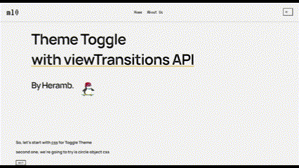
So, let's start with css for Toggle Theme

Now, thing we're going to try is circle object with css

                        
                            ::view-transition-new(root) {
                                mask: url('data:image/svg+xml,')
                                    center / 0 no-repeat;
                                animation: scale 1s;
                            }
                            
                            ::view-transition-old(root),
                            .dark::view-transition-old(root) {
                                animation: none;
                                z-index: -1;
                            }
                            .dark::view-transition-new(root) {
                                animation: scale 1s;
                            }
                            
                            @keyframes scale {
                                to {
                                mask-size: 200vmax;
                                }
                            }


Now, thing we're going to try is circle object initiating from left top.

                        
                            ::view-transition-group(root) {
                                animation-timing-function: var(--expo-out);
                                }
                                
                            ::view-transition-new(root) {
                                mask: url('data:image/svg+xml,') top left / 0 no-repeat;
                                mask-origin: content-box;
                                animation: scale 1s;
                                transform-origin: top left;
                                }
                                
                            ::view-transition-old(root),
                                .dark::view-transition-old(root) {
                                animation: scale 1s;
                                transform-origin: top left;
                                z-index: -1;
                                }
                                
                            @keyframes scale {
                                to {
                                mask-size: 350vmax;
                                }
                            }


Now, getting a pan screen using clip paths.

                        
                            ::view-transition-group(root) {
                                animation-duration: 0.7s;
                                animation-timing-function: var(--expo-out);
                            }
                                    
                            ::view-transition-new(root) {
                                animation-name: reveal-light;
                            }
                            
                            ::view-transition-old(root),
                            .dark::view-transition-old(root) {
                                animation: none;
                                z-index: -1;
                            }
                            .dark::view-transition-new(root) {
                                animation-name: reveal-dark;
                            }
                            
                            @keyframes reveal-dark {
                                from {
                                    clip-path: polygon(50% -71%, -50% 71%, -50% 71%, 50% -71%);
                                }
                                to {
                                clip-path: polygon(50% -71%, -50% 71%, 50% 171%, 171% 50%);
                                }
                            }
                            
                            @keyframes reveal-light {
                                from {
                                clip-path: polygon(171% 50%, 50% 171%, 50% 171%, 171% 50%);
                                }
                                to {
                                    clip-path: polygon(171% 50%, 50% 171%, -50% 71%, 50% -71%);
                                }
                            }


Here's, to the crazy ones.

Now, let's level up with adding a gif overlay.

                        
                            ::view-transition-group(root) {
                                animation-timing-function: var(--expo-in);
                            }
                            
                            ::view-transition-new(root) {
                                mask: url('https://media.tenor.com/cyORI7kwShQAAAAi/shigure-ui-dance.gif') center / 0 no-repeat;
                                animation: scale 3s;
                            }
                            
                            ::view-transition-old(root),
                            .dark::view-transition-old(root) {
                                animation: scale 3s;
                            }
                            
                            @keyframes scale {
                                0% {
                                mask-size: 0;
                                }
                                10% {
                                mask-size: 50vmax;
                                }
                                90% {
                                mask-size: 50vmax;
                                }
                                100% {
                                mask-size: 2000vmax;
                                }
                            }


Guess, who this one is?

                        
                            ::view-transition-group(root) {
                                animation-timing-function: var(--expo-in);
                            }
                            
                            ::view-transition-new(root) {
                                mask: url('https://media.tenor.com/Jz0aSpk9VIQAAAAi/i-love-you-love.gif') center / 0 no-repeat;
                                animation: scale 1.5s;
                            }
                            
                            ::view-transition-old(root),
                            .dark::view-transition-old(root) {
                                animation: scale 1.5s;
                            }
                            
                            @keyframes scale {
                                0% {
                                mask-size: 0;
                                }
                                10% {
                                mask-size: 50vmax;
                                }
                                90% {
                                mask-size: 50vmax;
                                }
                                100% {
                                mask-size: 2000vmax;
                                }
                            }


These are two animating functions, I used.

                        
                            :root {
                                --expo-in: linear(
                                    0 0%, 0.0085 31.26%, 0.0167 40.94%,
                                    0.0289 48.86%, 0.0471 55.92%,
                                    0.0717 61.99%, 0.1038 67.32%,
                                    0.1443 72.07%, 0.1989 76.7%,
                                    0.2659 80.89%, 0.3465 84.71%,
                                    0.4419 88.22%, 0.554 91.48%,
                                    0.6835 94.51%, 0.8316 97.34%, 1 100%
                                );
                                --expo-out: linear(
                                    0 0%, 0.1684 2.66%, 0.3165 5.49%,
                                    0.446 8.52%, 0.5581 11.78%,
                                    0.6535 15.29%, 0.7341 19.11%,
                                    0.8011 23.3%, 0.8557 27.93%,
                                    0.8962 32.68%, 0.9283 38.01%,
                                    0.9529 44.08%, 0.9711 51.14%,
                                    0.9833 59.06%, 0.9915 68.74%, 1 100%
                                );
                            }


I hope, this one builds up your context over viewTransitions API; keep tinkering, and keep hacking!

GitHub LinkedIn X(Twitter)